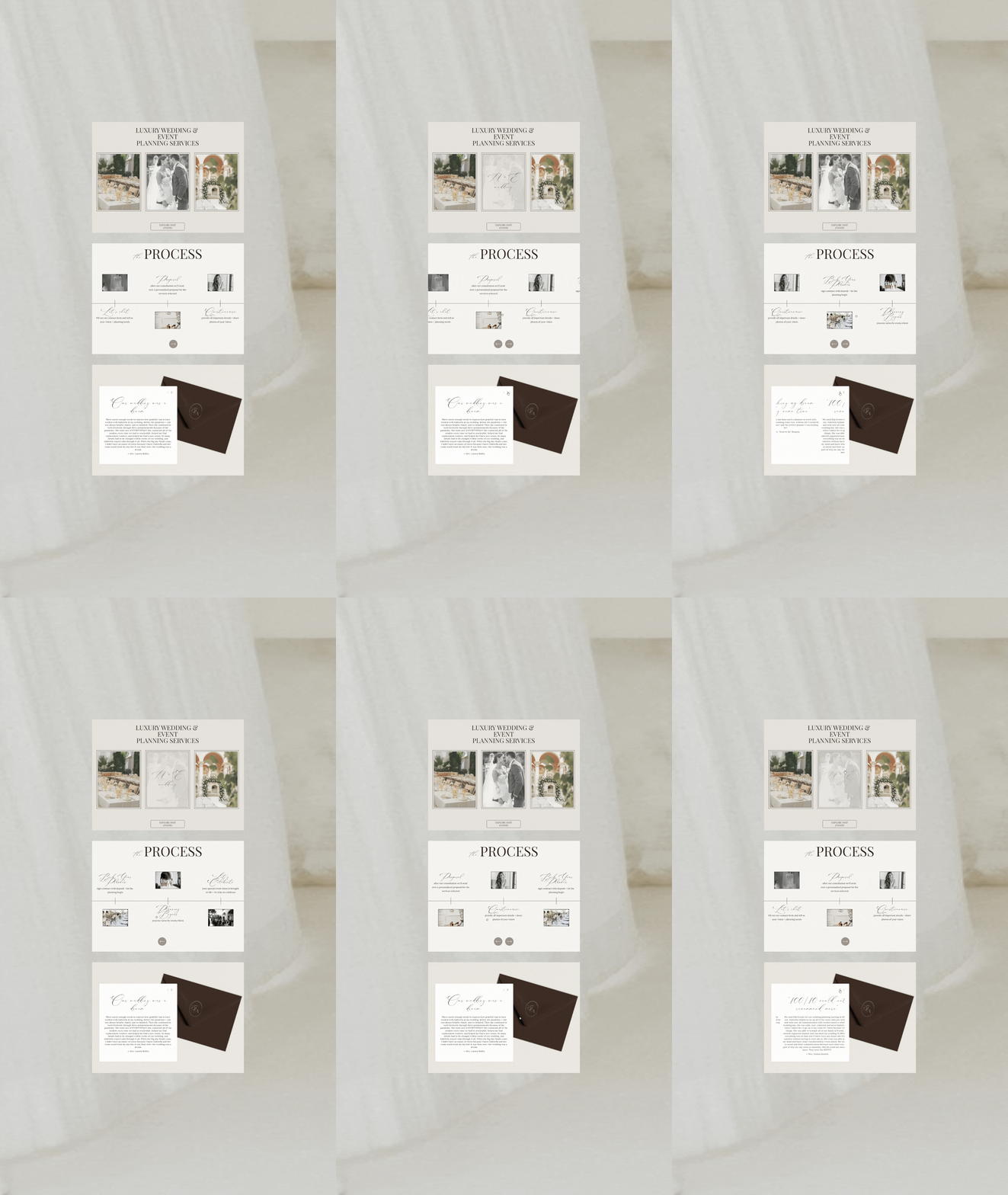
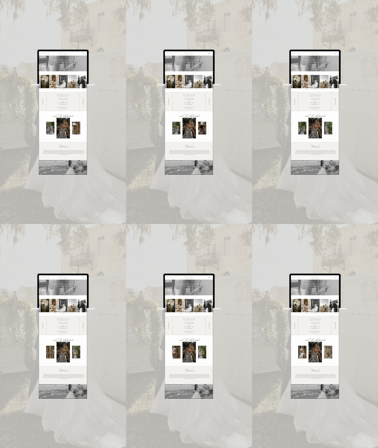
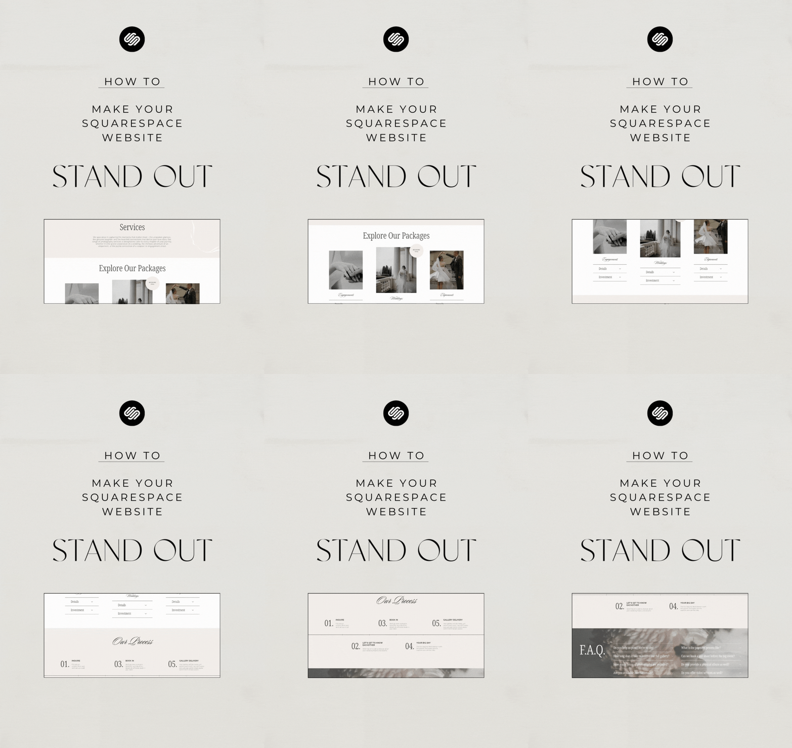
Standing Out in Style: Making Your Squarespace Website Shine
In the vast digital landscape, making your Squarespace website stand out is like wearing a unique outfit in a crowded room. You want heads to turn, eyes to linger, and visitors to remember your site long after they've clicked away. In this blog post, we'll dive into the art of crafting a standout Squarespace website that's as distinct as you are!
1. Define Your Brand's Unique Voice
Before you dive into design, think about what sets your brand apart. What's your story? Your values? Your unique selling points? Infuse these elements into your website's content, visuals, and overall vibe. Your Squarespace site should be a reflection of your brand's personality.
2. Captivating Branding
Strong and cohesive brand design is essential for good website design. Define your logos, colors, typography system, icons and photography style and stick to it! Consistency will build brand awareness and show professionalism.
3. Craft Engaging Content
Content is king, and engaging content is like a magnetic force that keeps visitors glued to your site. Write compelling blog posts, share captivating stories, and provide valuable insights that make people want to come back for more. Remember, quality content builds trust and establishes you as an authority in your field.
4. Emotional Imagery
Your imagery can make or break your website. Use high-quality, professional imagery with a consistent style. The imagery should be relevant and evoking emotions and representing the vibe of your brand.
5. Add Interactive Elements and Animations
Engage your visitors with interactive elements that keep them involved. Consider adding polls, quizzes, surveys, or even a live chat feature. Animations and videos can easily capture your visitors attention making a memorable experience and encourage visitors to stay longer.
6. Leverage Visual Storytelling
Use visuals to tell a story. Incorporate videos, animations, or even a captivating background image that sets the tone for your website. Get creative with the layouts and make sure to guide your visitors with a clear intention and easy navigation.
Remember, your Squarespace website is your digital canvas. With a blend of creativity, authenticity, and strategic design, you can make it stand out in a way that resonates with your audience and leaves a memorable imprint. So, go ahead and infuse your website with your unique spark.


