

Moody Editorial Website Design for a Talented Destination Wedding Photographer Malia
When Malia reached out, she had a clear vision for her work. Her photography was already refined, emotional, and cinematic. We’ve worked together before, and her website was perfect for who she was at the time, but as her brand elevated over the years, her website needed a little tranformation as well. This project was about creating a website that felt intentional, immersive, and confident, while still allowing the imagery to lead.


An Editorial Experience, Built to Feel Cinematic
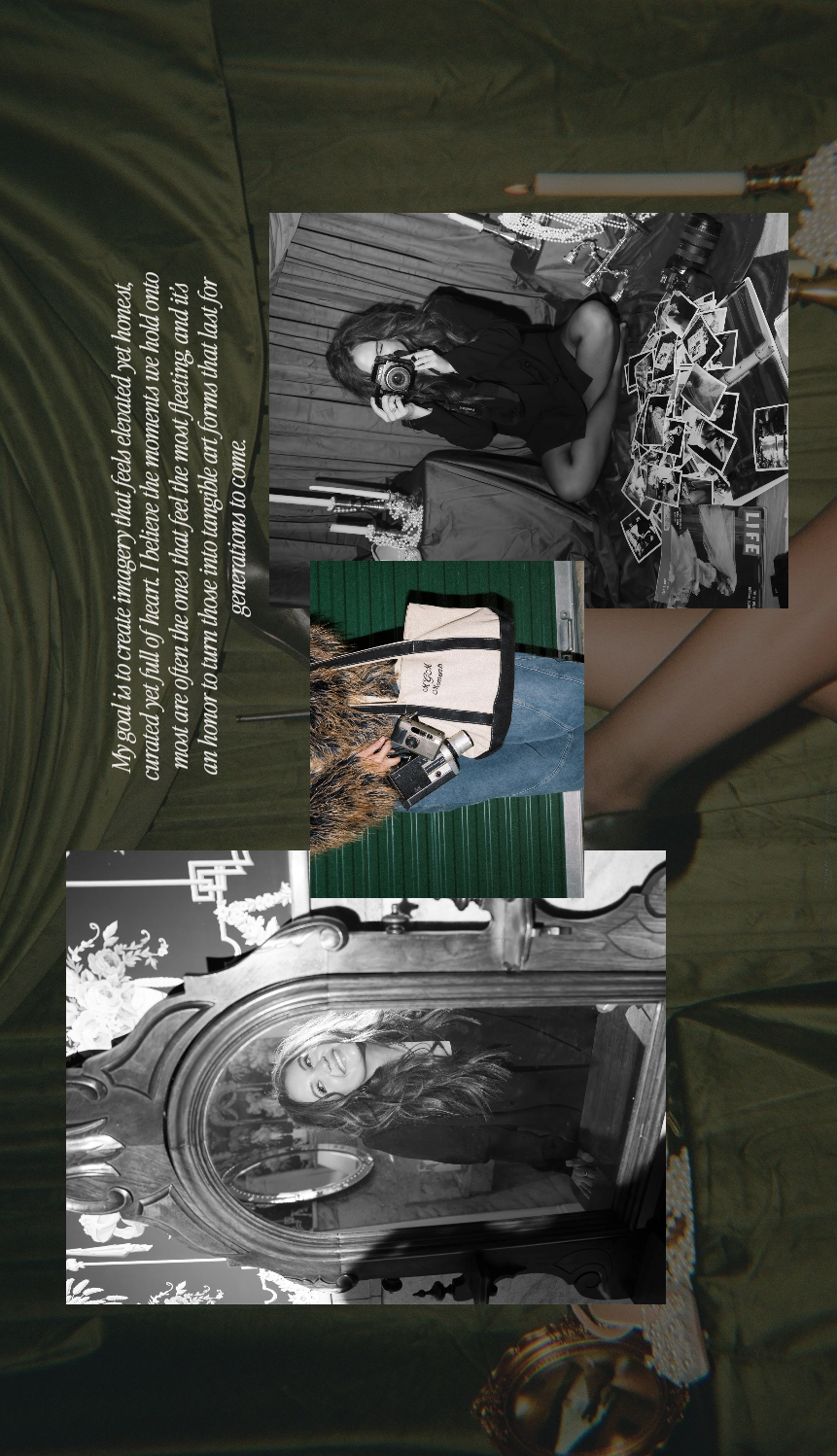
Malias work is emotional and atmospheric, layered with movement, shadow, and quiet intensity. Nothing about it feels rushed or surface-level. The website needed to honor that depth without becoming heavy or overwhelming, and without relying on trends that would quickly feel dated.
Rather than asking how to make the site “stand out,” we focused on a more important question: how should this work feel when someone experiences it online?
The answer guided every decision. The website needed to feel editorial and considered, with imagery at the center. It needed to make an emotional first impression, positioning Malia confidently as a destination wedding photographer while quietly attracting couples who value romance, mood, and storytelling. Timeless structure and intentional restraint became far more important than novelty.
Setting the Mood Through Contrast
The design direction naturally leaned moody and editorial, but not for the sake of drama alone. Contrast became the foundation of the site.
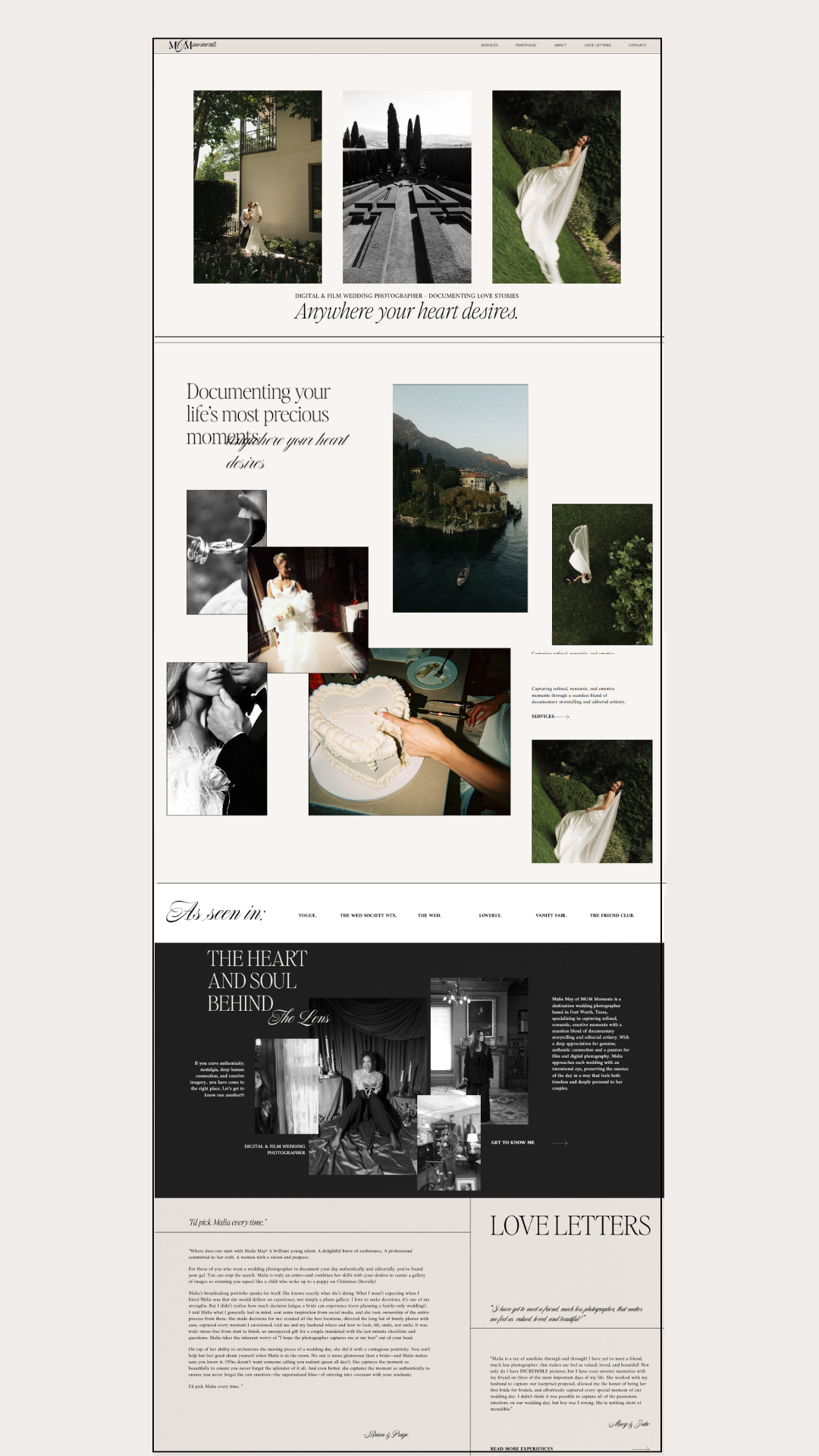
Light and dark sections move together throughout the pages, creating a rhythm that guides visitors gently from one moment to the next. The darker base tones were chosen deliberately to enhance the emotional weight of the imagery and to create a gallery-like atmosphere, similar to the pacing you’d find in an editorial spread.
Against this darker backdrop, lighter images and text feel more intentional. They draw the eye exactly where it needs to go. This balance allows the work to feel cinematic rather than flat, immersive rather than busy.
Letting the Work Lead the Way
On the homepage, we resisted the urge to explain everything at once.
Instead of leading with long introductions or dense copy, the site opens with strong, image-led moments. The photographs are given priority, supported by a clear visual hierarchy that makes the experience feel calm and intuitive.
Short phrases like “Timeless. Emotive. Romantic.” act as quiet anchors. They provide context without pulling attention away from the imagery, allowing visitors to form their own emotional connection first.
The collage-style layouts echo the way Malia documents weddings. Not as isolated highlights, but as layered, unfolding stories. Moments overlap, emotions build, and the experience feels lived-in rather than staged.
Typography That Supports the Story
Typography throughout the site was treated with the same care as the imagery.
Refined serif type was paired with clean, understated supporting text to maintain an editorial tone while keeping everything readable and grounded. The goal was softness without nostalgia, elegance without excess.
Nothing here exists purely for decoration. Every typographic choice supports clarity, pacing, and mood, allowing longer passages of text to feel inviting rather than heavy.
A Website That Feels Aligned
In the end, the finished website feels like a natural extension of Malia’s work.
It’s moody without being oppressive, editorial without feeling inaccessible, and refined without becoming rigid. Most importantly, it reflects the emotional and intentional nature of her photography, positioning her clearly as a destination wedding photographer whose work is rooted in story.
This project is a reminder that strong website design doesn’t compete with the art. It holds it, supports it, and gives it the space it deserves.
For creative professionals, that alignment makes all the difference.

