

Minimal & Elegant Brand Identity Design for an Italian Wedding Photographer
Case Study: Minimalist Branding for Donatella Corriero, Italian Wedding and Elopement Photographer
This brand identity was created for Donatella Corriero, an Italian wedding and elopement photographer. The visual direction is minimalist, editorial, and rooted in quiet luxury. The identity relies on typography, spacing, texture, and a muted palette to create a refined first impression that supports the photography rather than competing with it.
Across the collateral, the brand feels calm and confident. It communicates premium service, intentional artistry, and timeless romance, which is exactly what couples want to feel when they are choosing someone to document such a personal day.
Project goals and objectives
001. Position the brand in the luxury market without feeling flashy
The goal was not to look trendy or loud. It was to feel expensive through restraint. Minimal design, strong typography, and lots of breathing room all signal a premium brand because they suggest confidence and clarity.
002. Create an identity that lets photography lead
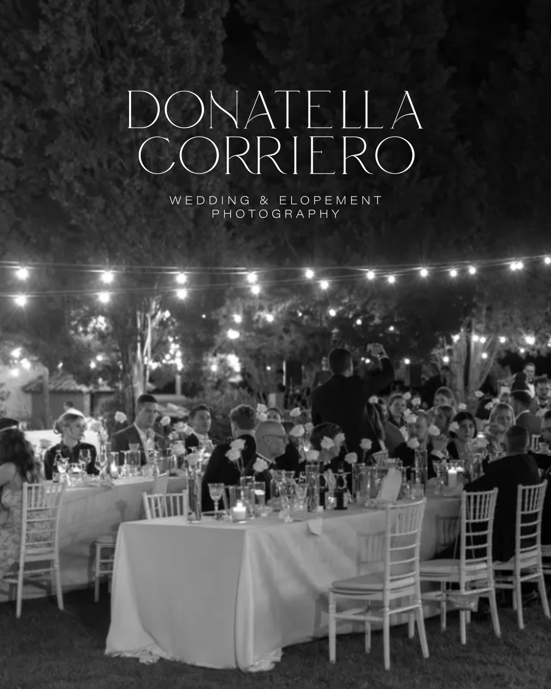
The logo system needed to sit quietly alongside imagery. Your mockups show black-and-white photography, soft paper textures, and an editorial layout style. All of those choices keep the portfolio as the hero.
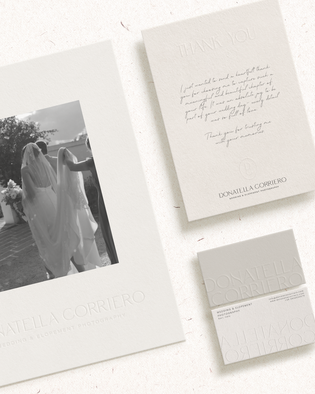
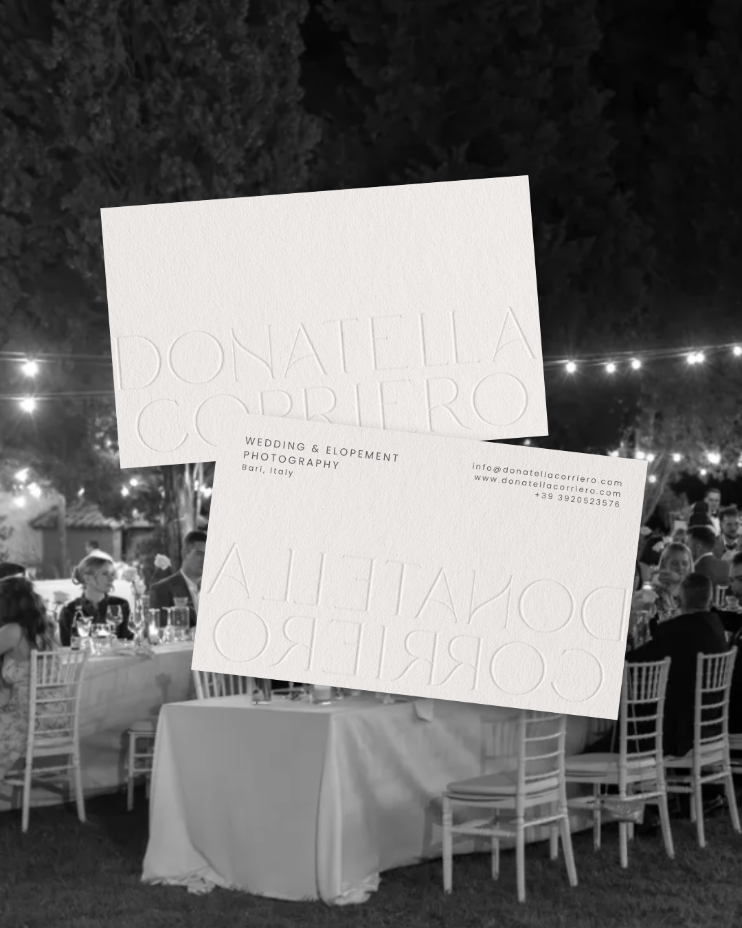
003. Build a versatile system for digital and print
This brand needed to work on a website, social media, watermarks, and printed pieces. You delivered that through a clean primary wordmark, a simplified monogram mark, and layout rules that are consistent across touchpoints.
004. Communicate timeless romance with modern elegance
This is not rustic, boho, or overly feminine. It’s romantic in a refined way, similar to fashion editorials and high-end stationery.
Design approach and logo strategy
The main logo is a customized serif wordmark set in uppercase, with generous spacing and a very editorial feel. This style choice communicates a few things instantly:
Luxury and heritage: High-contrast serifs are strongly associated with premium brands and print publishing.
Calm confidence: The thin strokes and wide spacing feel intentional and restrained.
Timelessness: Serif typography ages well and feels classic in a way that trend fonts usually do not.
The hierarchy in the lockup is also doing a lot of work. The name is the hero, and the descriptor “Wedding & Elopement Photography” is smaller, widely tracked, and understated. That makes the brand feel elevated and not salesy.
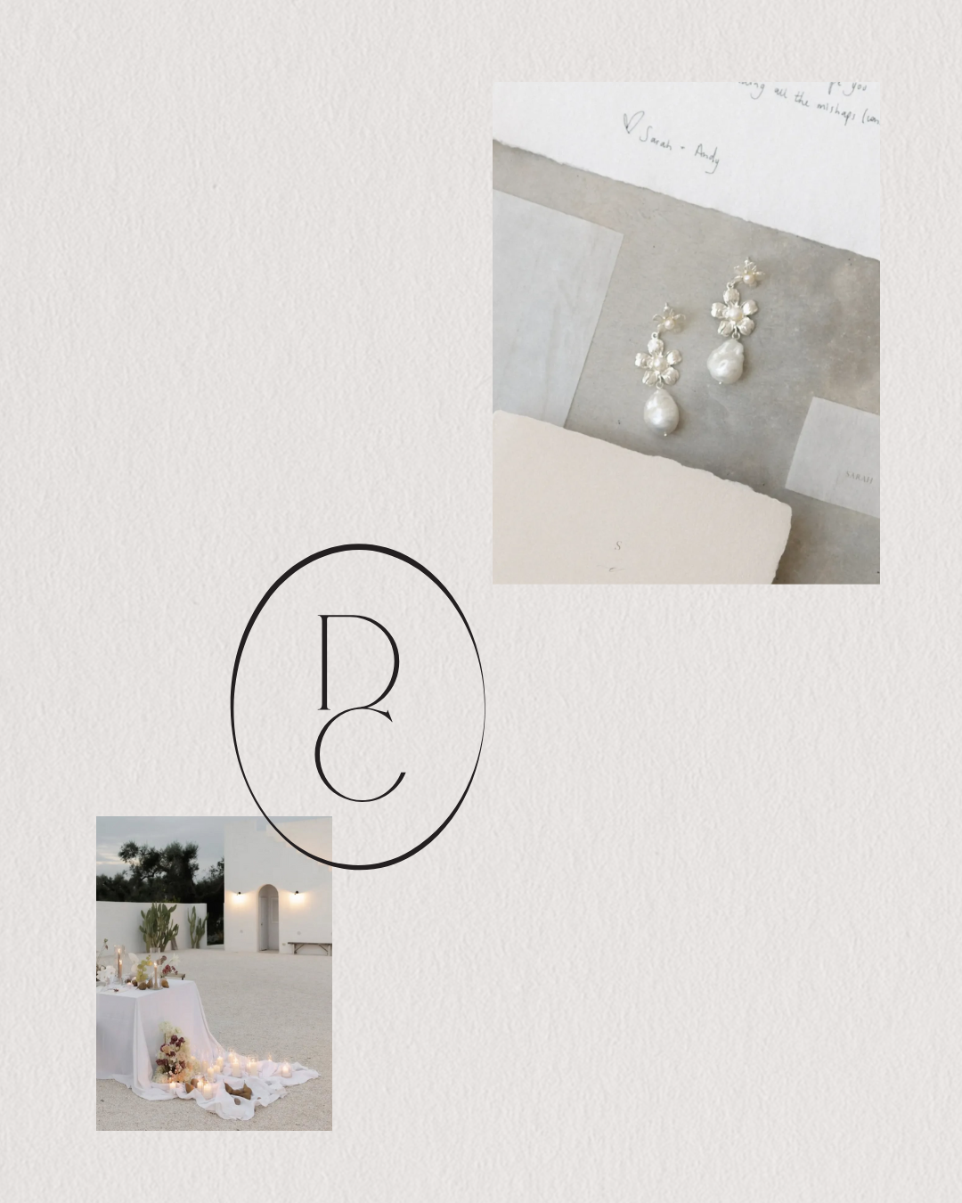
One of the most distinctive parts of this identity is how much the brand relies on negative space. The layouts you shared feel like a gallery wall or a printed editorial spread, with images placed intentionally and plenty of room to breathe. That approach signals luxury because it feels curated, not crowded.
Color palette psychology and why it works
From your palette image, the colors live in a family of soft neutrals and grounded darks: airy greys, warm ivories, muted beige tones, plus a deep charcoal/green-black anchor.
Here is the psychology behind that choice.
Soft ivory and warm neutrals ( romantic, gentle, intimate, timeless )
They connect to wedding materials people already associate with luxury, like handmade paper, linen, silk, and stone.
Muted greys ( sophistication, editorial polish, calm neutrality)
They also prevent the palette from feeling overly sweet. This helps position the brand as modern luxury rather than “cute wedding branding.”
The deep anchor shade ( contrast for legibility, depth, seriousness and professionalism )
It grounds the softness so the brand still feels confident and premium.
Why this color palette is perfect for a photographer
Neutrals are ideal for photography brands because they do not fight the work. Your black-and-white imagery, soft textures, and romantic scenes can shift from bright to moody, indoor to outdoor, and the palette still fits.
Editorial minimalist luxury with Italian romantic influence
This identity is built to attract couples who care about aesthetics and details. For the couples who want a calm, high-touch experience and are drawn to timeless, editorial photography. The visual identity communicates “you’re in good hands” before the client reads a single testimonial. It feels premium, curated, and emotionally warm. This branding project was designed to position Donatella Corriero as a refined, editorial wedding photographer working with modern, style-conscious couples. Every decision, from the typography to the color palette to the spacing and print applications, was made to communicate quiet luxury, emotional storytelling and timeless elegance.
The final identity feels calm, confident and intentional. It allows the photography to lead while still creating a recognizable and elevated brand presence across website, social media and printed materials. Most importantly, it aligns with the level of experience and artistry the photographer offers her clients.
Are you ready to invest in your dream brand too?
If you are ready for a brand that feels aligned, elevated and truly reflective of your work, I would love to create it with you. Whether you are repositioning into the luxury market or simply want a visual identity that finally feels like you, this is your moment to step into it.
Your dream clients are already looking for someone like you.
Let’s create a brand that makes them stop, feel something, and choose you.