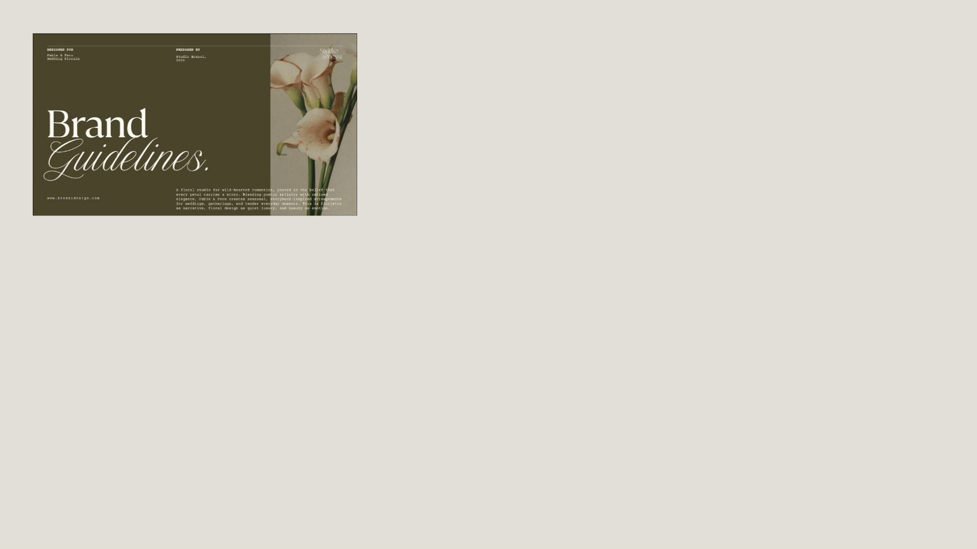
Florist Branding Example: Behind the Scenes of the Fable & Fern
Some branding projects feel especially magical, the kind that instantly create an entire world the moment you see them. Fable & Fern was exactly that, and it’s such a beautiful florist branding example of what’s possible when strategy and design come together with intention.
Designed for a wedding floral studio rooted in romance and storytelling, this project was an opportunity to craft branding that feels timeless, elevated, and emotionally resonant. Not just “pretty florals,” but a full experience: soft luxury, poetic detail, and editorial refinement. This is exactly what branding for florists can do when it’s built with purpose.
In this post, I’m taking you behind the scenes of the strategy and design process, and showing how intentional florist branding can completely transform the way a florist shows up in the wedding industry.
The Vision Behind Fable & Fern
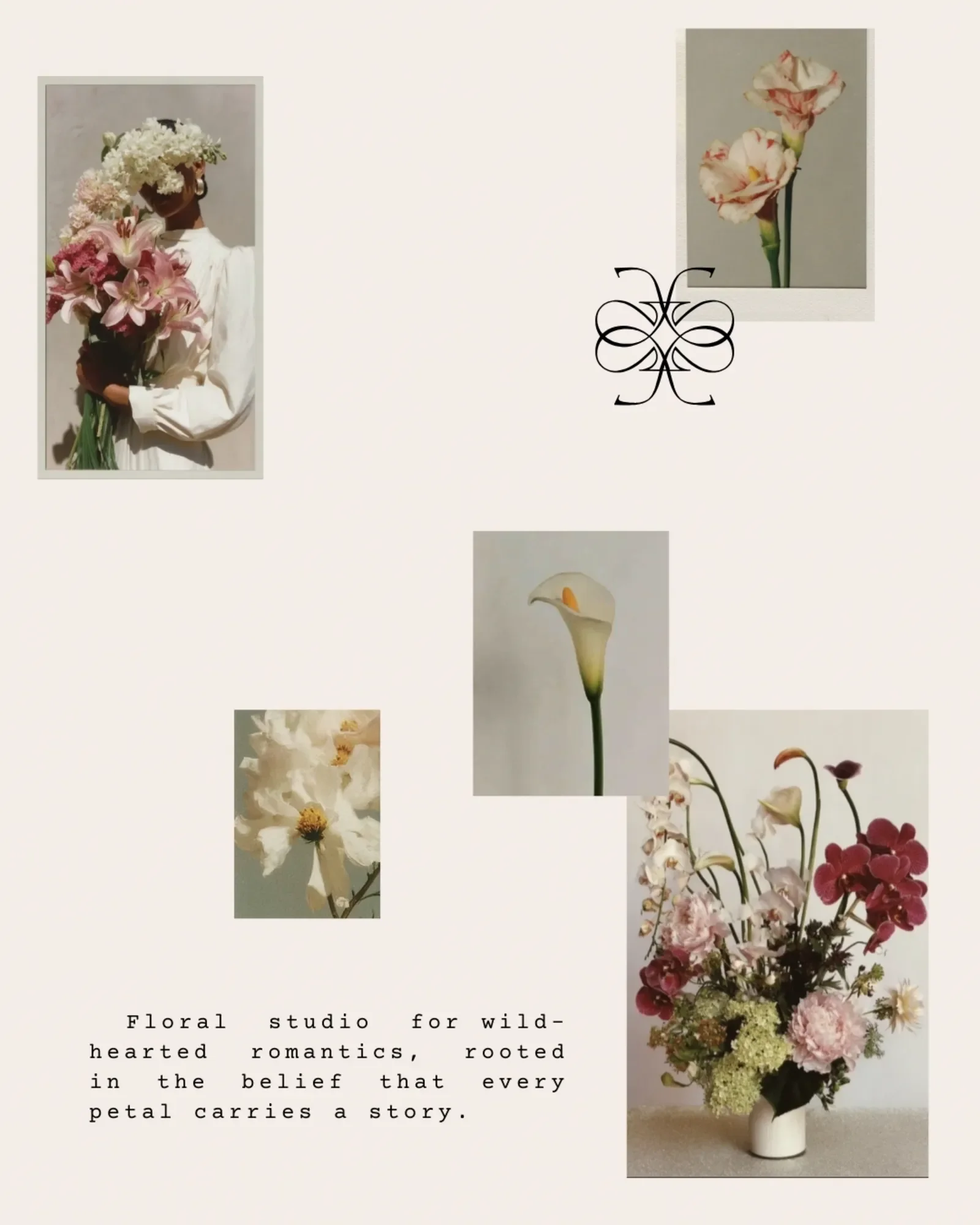
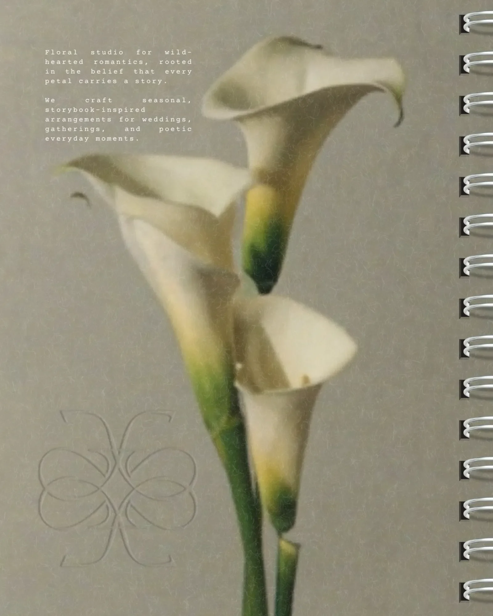
Fable & Fern is a wedding floral studio for wild-hearted romantics, grounded in the belief that every petal carries a story. From the beginning, we wanted this brand to feel like an atmosphere.
The goal was to create a poetic aesthetic that felt:
Storybook-inspired
Timeless and sophisticated
Romantic but not overly traditional
Editorial, elevated, and artful
Rooted in emotion and meaning
This brand was designed to attract couples who value artistry, depth, and intentional details. The kind of clients who want florals that feel unforgettable.
Designing Brands Strategy-First
We always begin with strategy, because the strongest florist branding starts long before the visuals.
Fable & Fern’s strategy centered around one core idea:
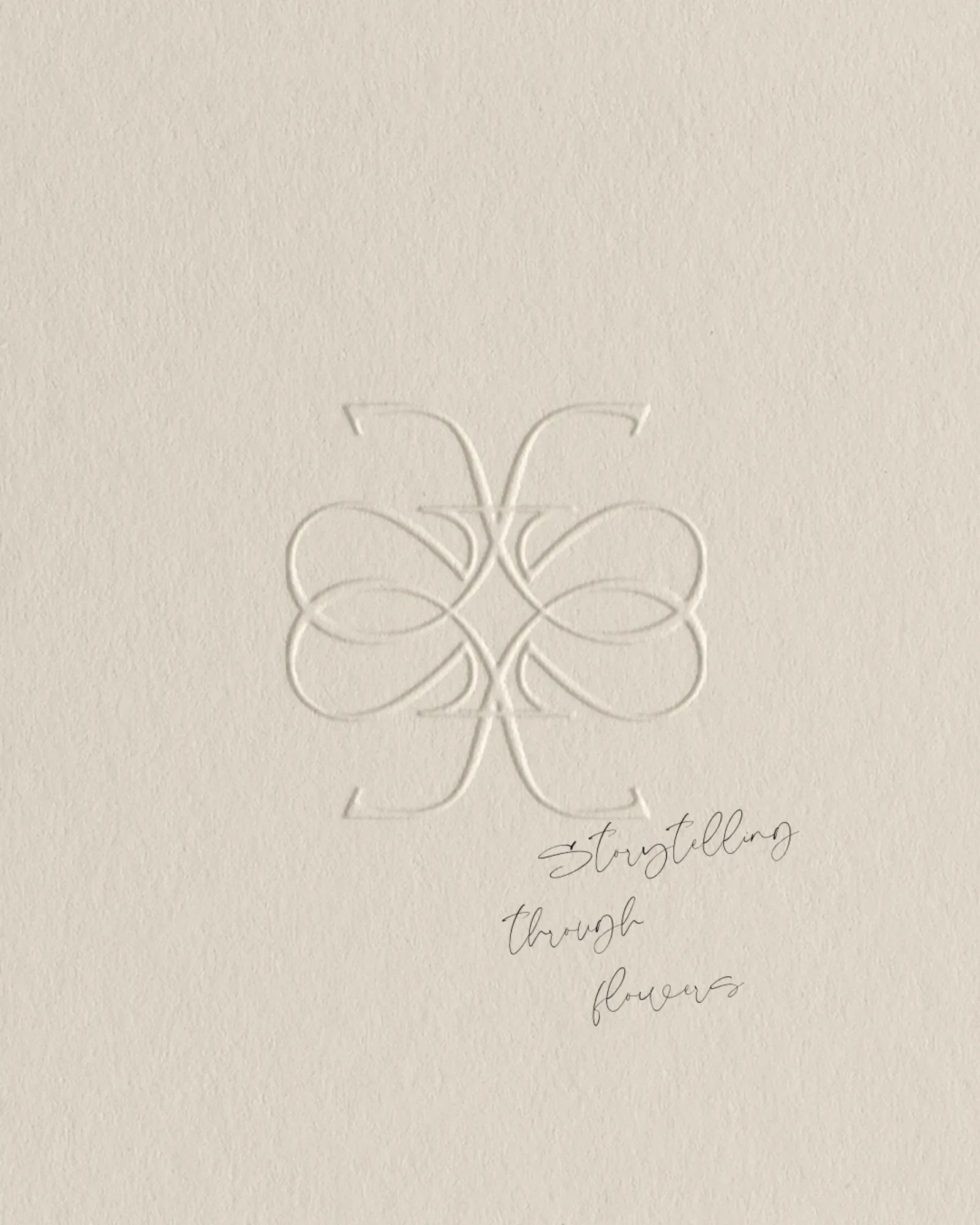
Florals as storytelling, crafted with editorial elegance and tender luxury.
That became our creative compass for every design decision. The strategy for Fable & Fern was rooted in positioning the studio as a floral storyteller for wild-hearted romantics seeking more than just beautiful arrangements. Rather than focusing on trends or traditional wedding floristry, the brand was built around emotion, atmosphere, and intentional design, creating an elevated experience that feels timeless, personal, and editorial. Every element of the strategy centered on the idea that florals can carry meaning, transform moments into memories, and reflect a softer, more poetic approach to celebration, allowing Fable & Fern to stand out as a boutique studio defined by tender luxury and artistry.
This strategic foundation became our creative compass for every design decision that followed.
Design Decisions Rooted in Strategy
Once the strategy was clear, the visual identity came to life intentionally.
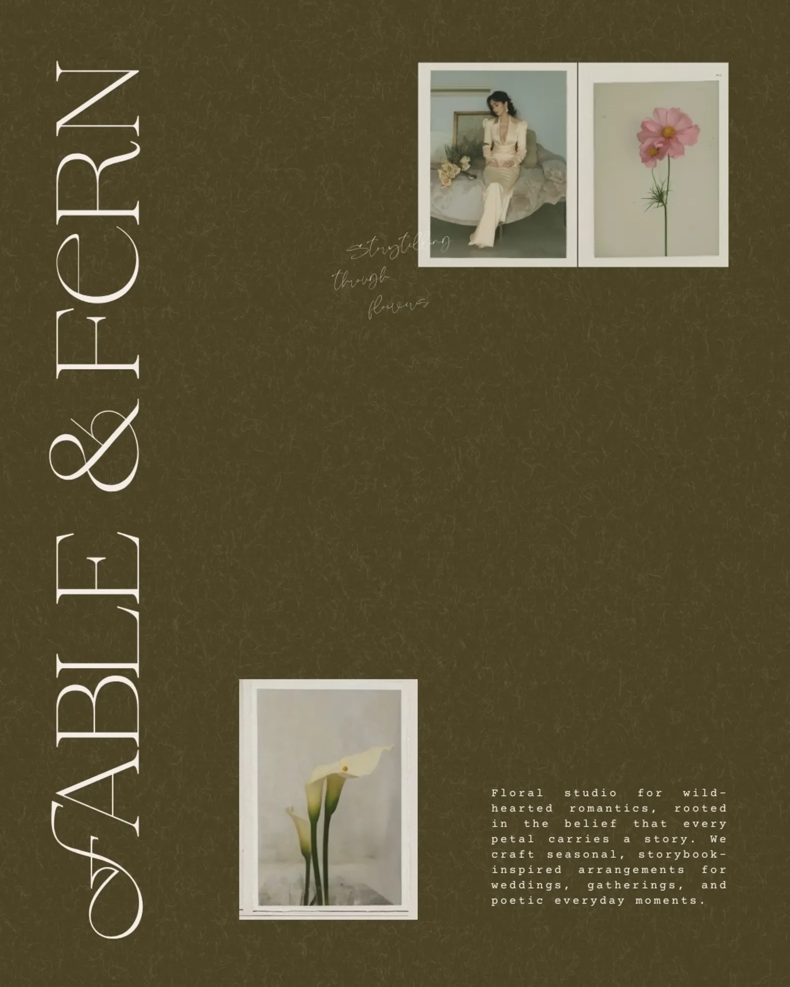
Elegant Editorial Typography
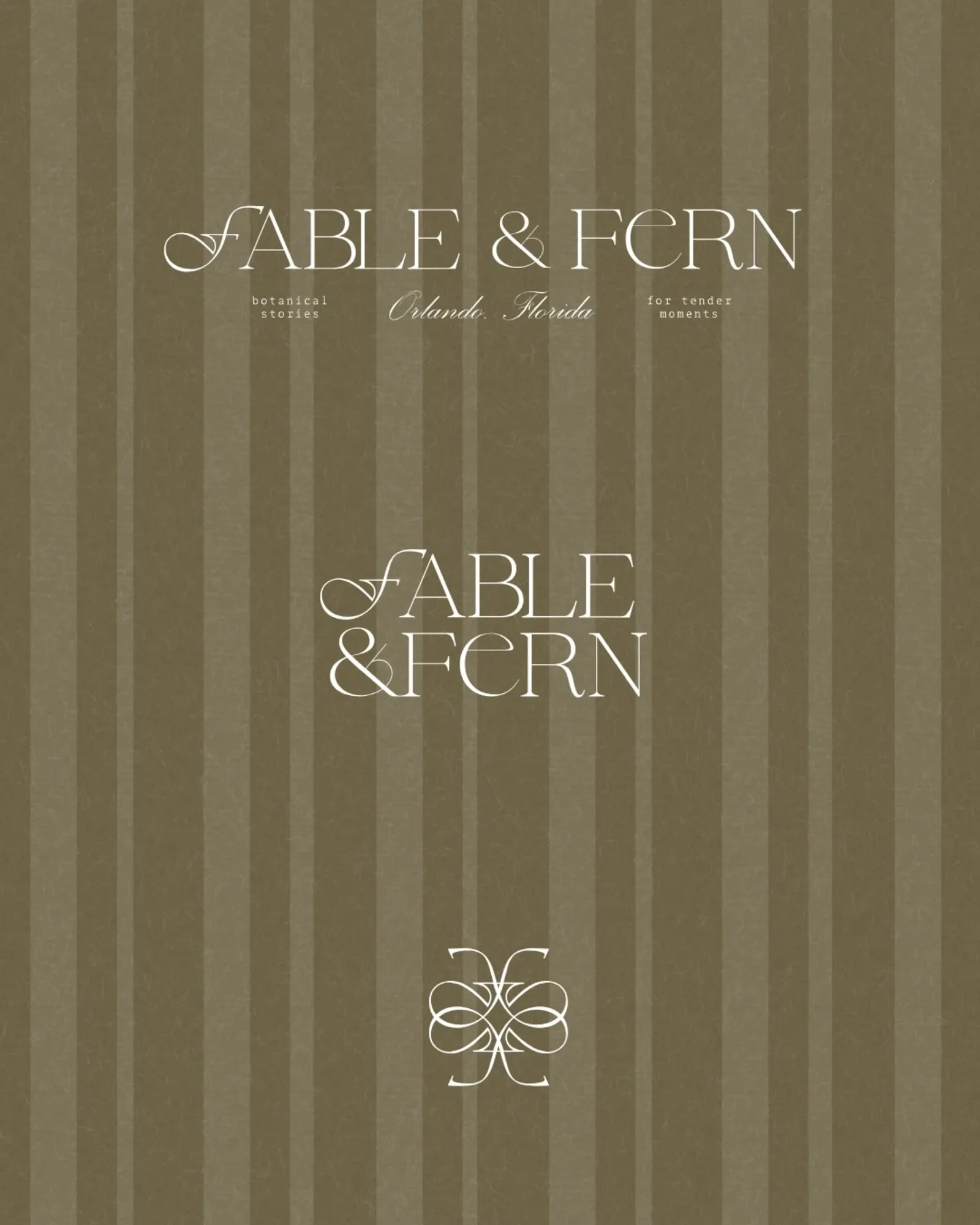
We chose high-contrast serif typography to reflect refinement, romance, and timeless sophistication. This style is often seen in luxury fashion editorials and heritage brands, making it a perfect fit for an elevated wedding florist.
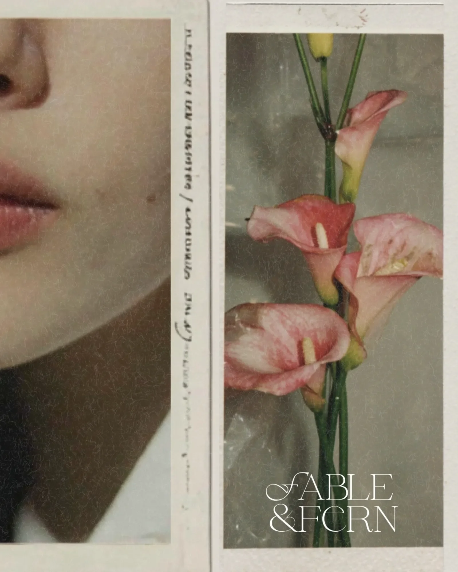
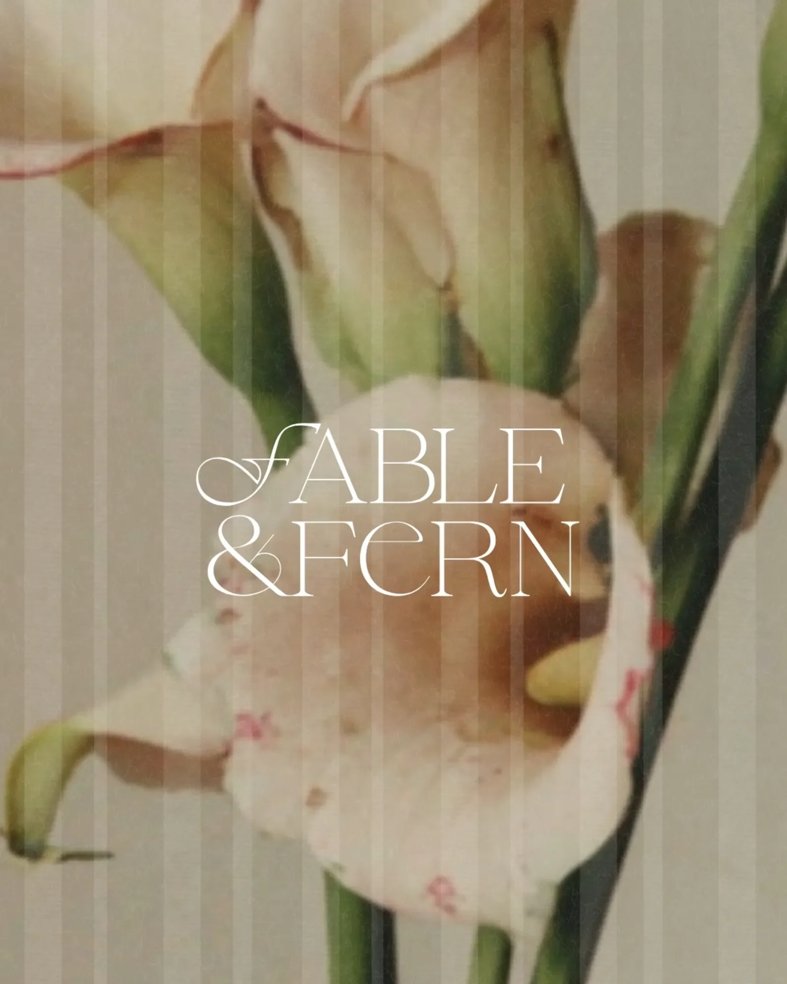
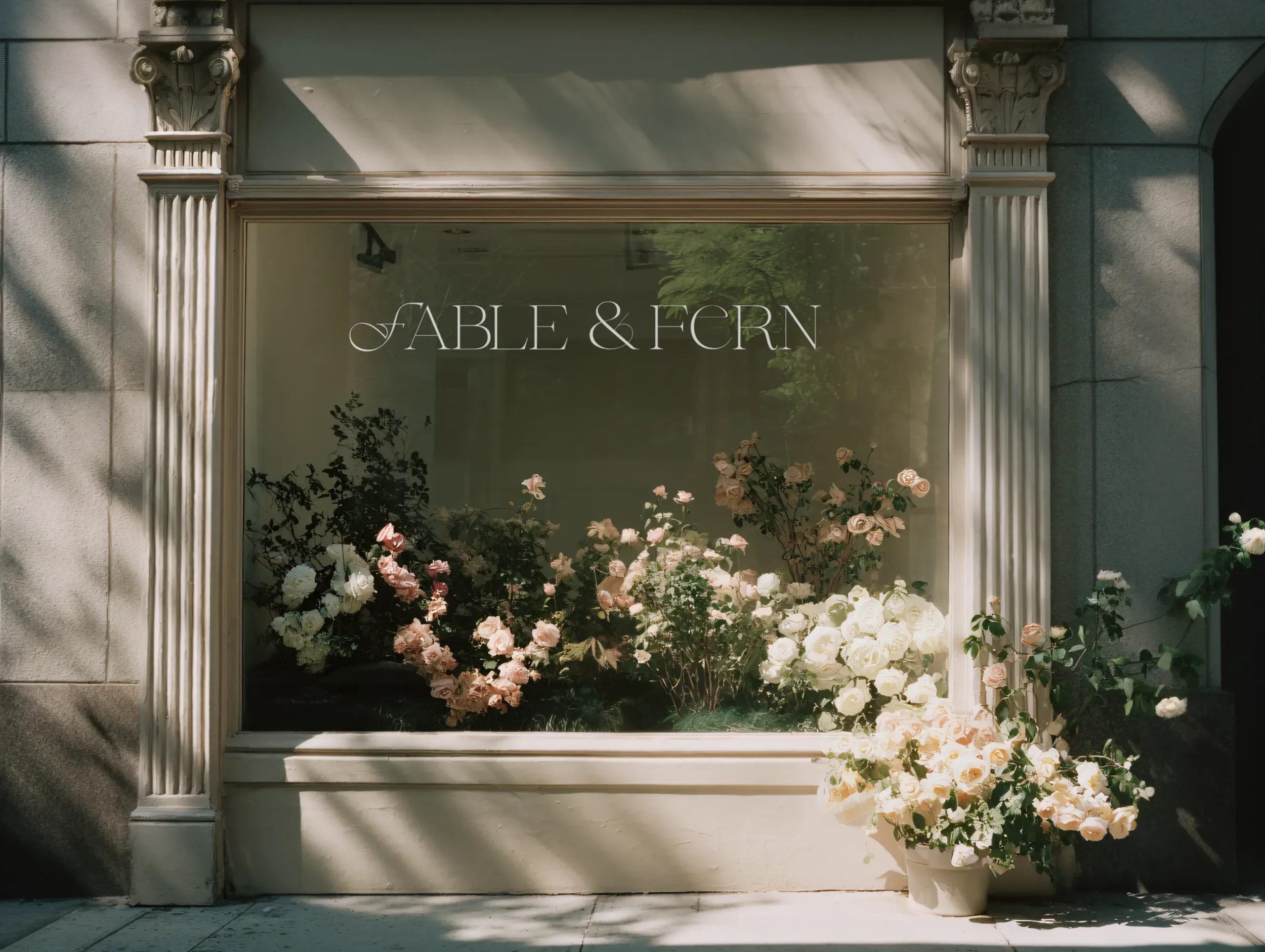
A Custom Florist Logo Mark
The custom flourished “F” was designed to feel like the beginning of a storybook — an heirloom initial, a romantic signature. This detail makes the florist logo instantly recognizable and reinforces the brand’s narrative identity.
Secret Garden Inspired Color Palette
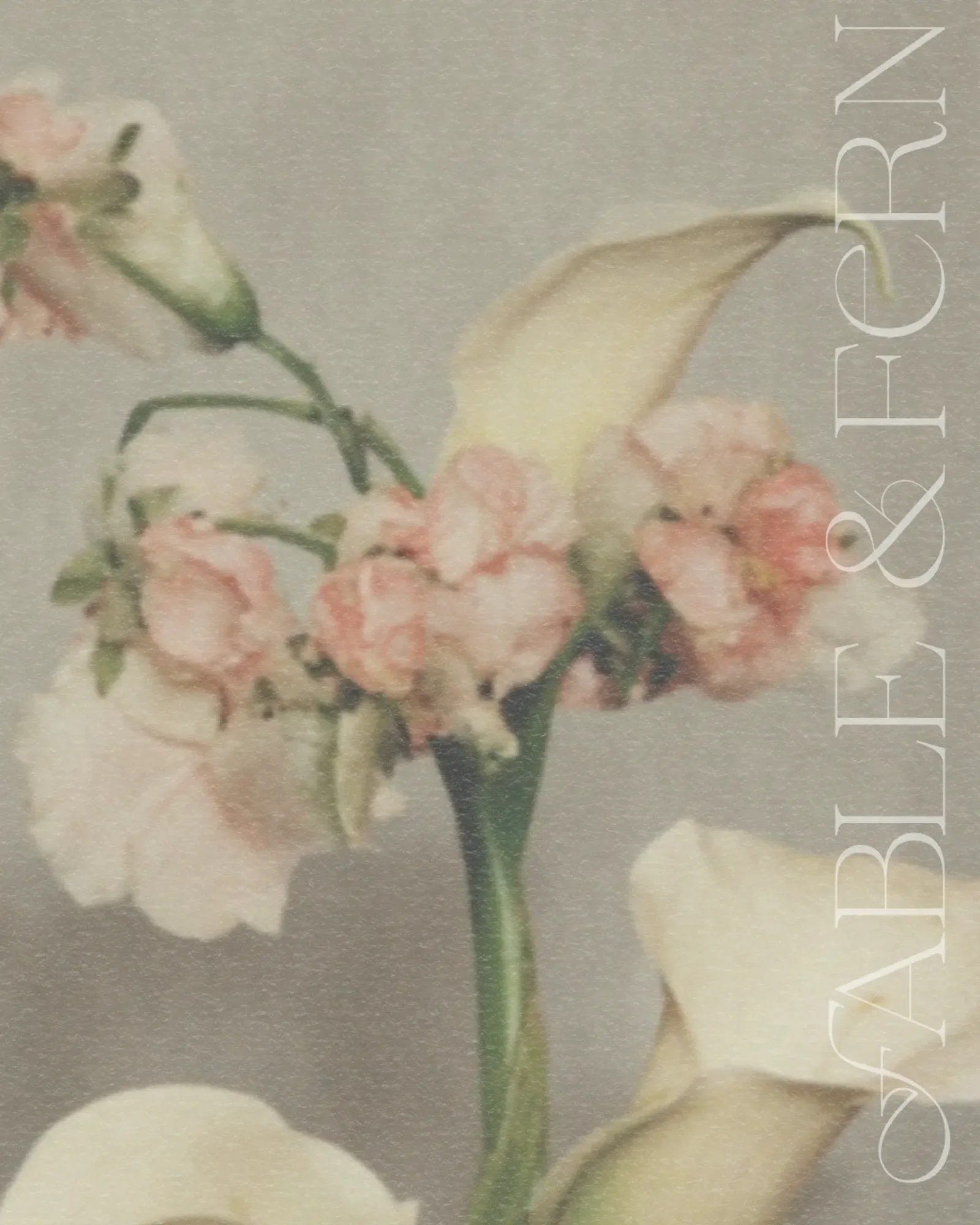
Muted botanical neutrals, mossy greens, gentle creams, and petal-inspired tones created an earthy yet elevated palette. It feels grounded in nature while still embracing a soft, editorial poetic aesthetic.
Vintage-Inspired Textures and Patterns
Film grain, paper textures, and vintage-style imagery were introduced to evoke nostalgia, intimacy, and quiet luxury — supporting the storybook atmosphere that defines Fable & Fern.
The Brand Identity
With this new brand identity, Fable & Fern is now positioned with a clear sense of refinement, romance, and intention. The visuals immediately communicate a boutique, editorial floral experience, attracting clients who value artistry, atmosphere, and meaningful details. Instead of blending into a saturated market of trendy florals, this florist branding example shows how a signature aesthetic can create real distinction. Every touchpoint - from the elegant florist logo to the nostalgic textures and poetic tone - works together to build a cohesive world rooted in storytelling. The result is a brand that not only looks beautiful, but builds trust, elevates perceived value, and supports the next chapter of growth with confidence and clarity.
Ready for Branding That Feels Like You?
If you’re ready to step into 2026 with intentional branding that attracts your dream clients and reflects your true artistry, I’m here to help.