An Artful Brand Identity for a Curated Homeware Collection
A warm, tactile brand identity for Maison Pearl, a curated collection of handcrafted homewares made by artisans around the world, where every piece carries a story of its own.
Maison Pearl is built around the belief that the most beautiful homes aren't perfectly styled but rather collected. A treasured object discovered while travelling. A handmade piece with tiny imperfections. Something created slowly, by someone whose hands and story are part of what makes it special.
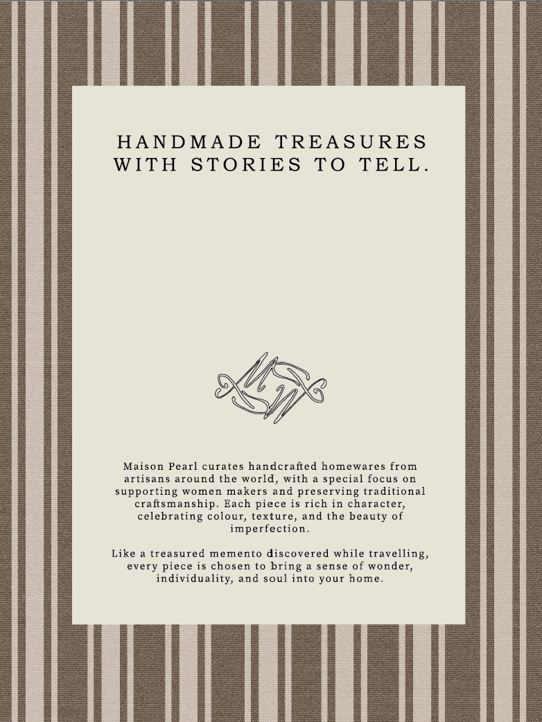
Curating handcrafted homewares from artisans around the world, Maison Pearl celebrates traditional craftsmanship, thoughtful design and objects with character. With a particular focus on supporting women makers, each piece is chosen not simply for how it looks, but for the story, skill and sense of connection behind it.
THE SCOPE
Custom Brand Identity Design
AESTHETIC
ORGANIC, RAW, TIMELESS, TACTILE, WARM, WELCOMING

✦ Creative Direction
Maison Pearl was never meant to feel like a polished luxury interiors brand, instead, we wanted to create something that felt curated and handcrafted.
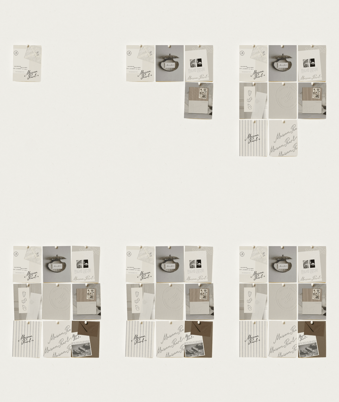
A little nostalgic. Like pages torn from an old interiors book, fabric swatches pinned to a moodboard, handwritten notes collected while travelling and objects brought home because you couldn't stop thinking about them. The creative direction combines old-world charm with a relaxed contemporary sensibility, allowing refinement and imperfection to exist side by side.
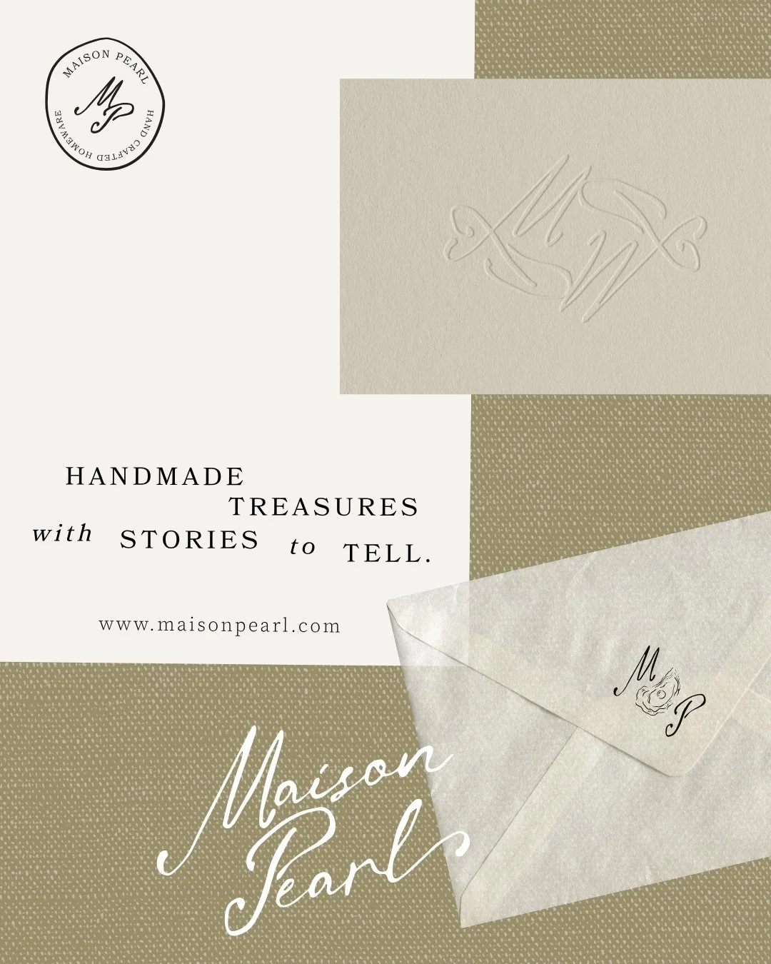
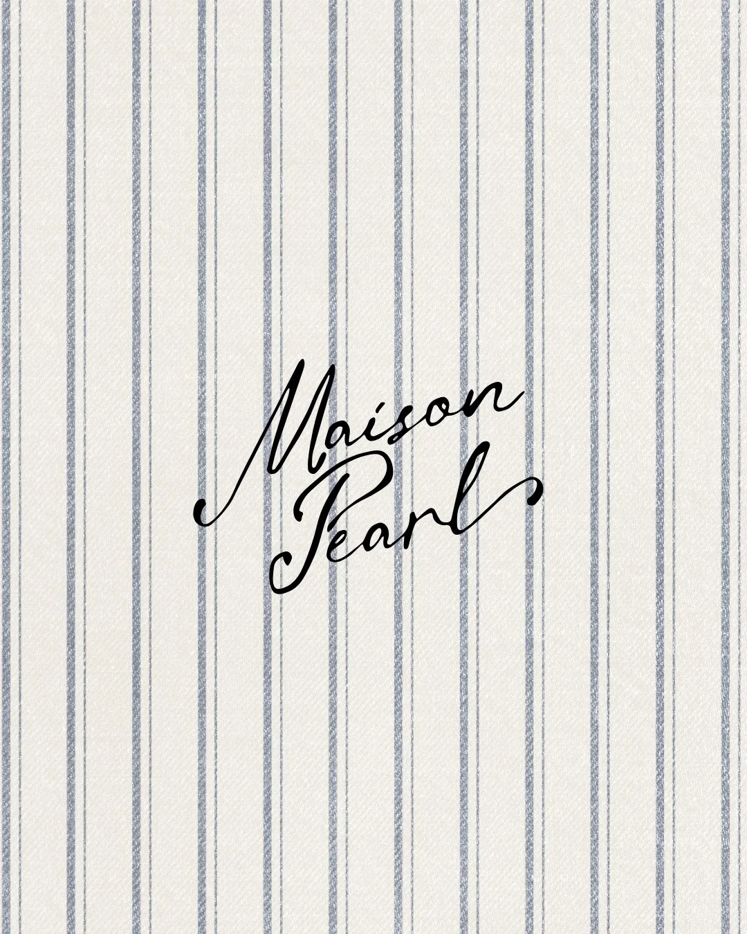
Soft ivory and earthy browns create a warm foundation, while muted olive, ticking stripes, woven textures and hand-drawn details make the identity feel layered and lived-in.
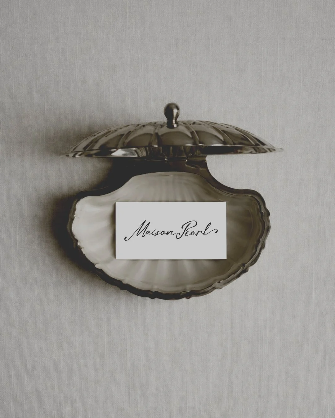
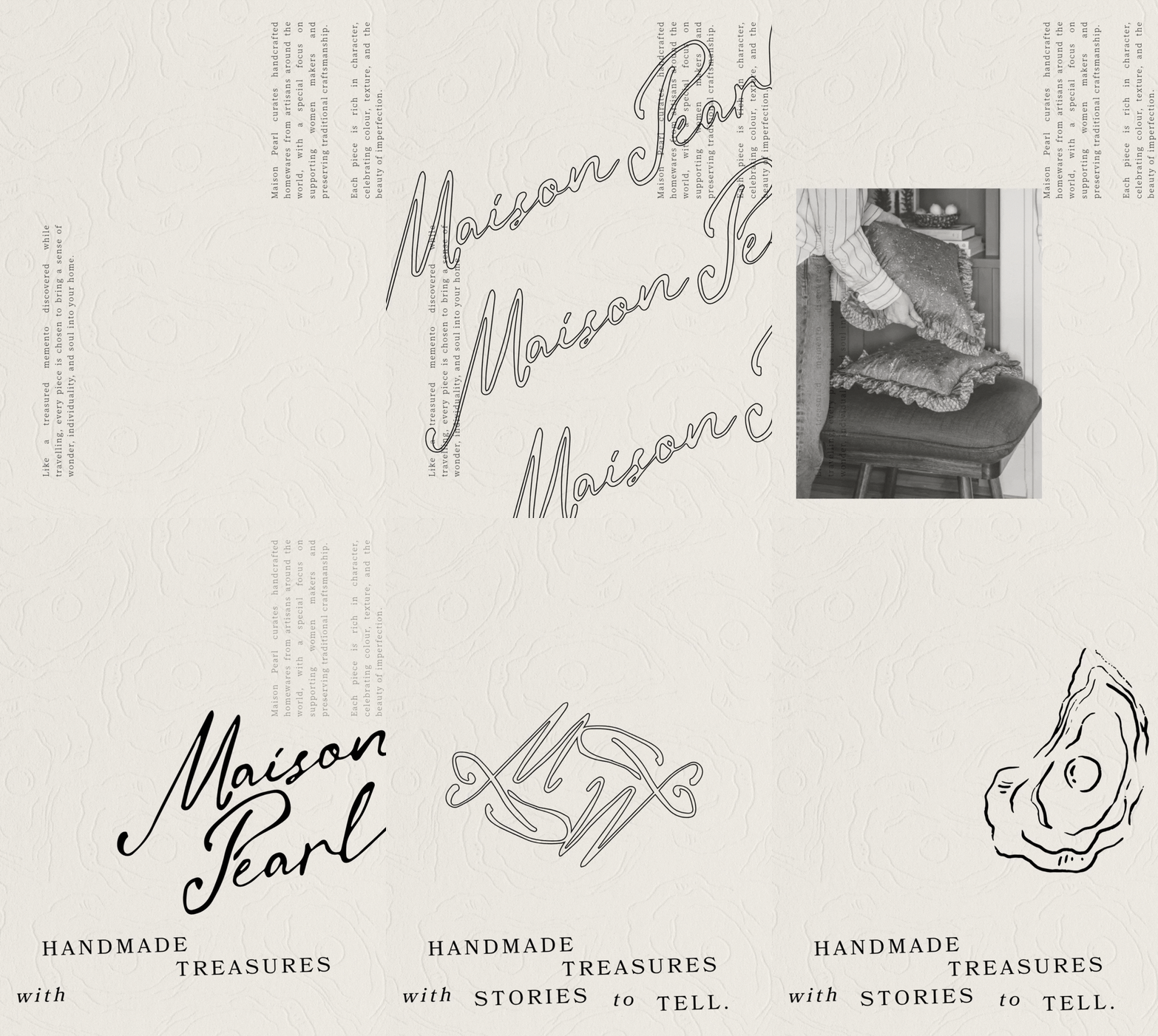
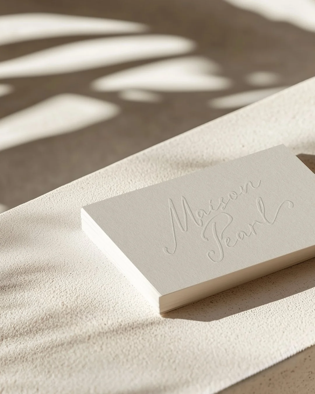
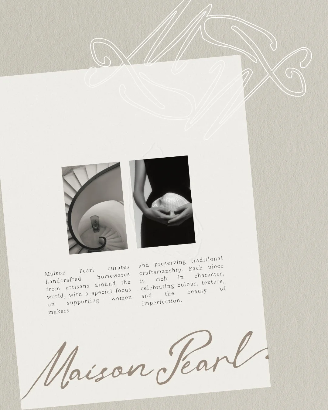
At the heart of the Maison Pearl brand identity is an organic handwritten style wordmark. Its fluid, imperfect letterforms bring a distinctly human quality to the brand and create an immediate connection to the handmade objects Maison Pearl curates.
✦ Final Brand Outcome
The pearl within the Maison Pearl name gave us a natural place to begin, but rather than leaning into the expected visual language of pearls, we took the idea back to its origin. The oyster became one of the brand's defining motifs.
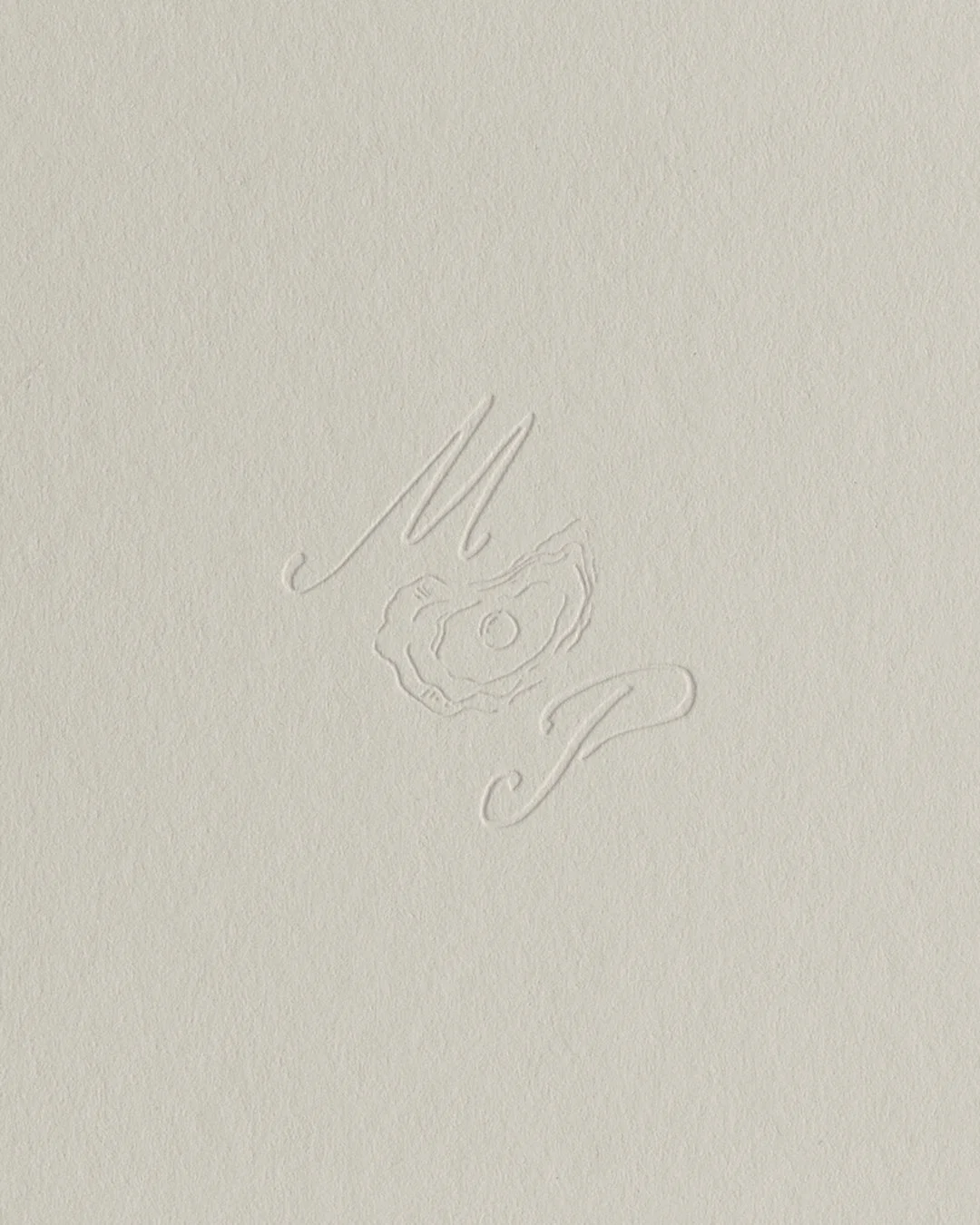
Loose, hand-drawn oyster illustrations introduce an element of charm and imperfection, while the MP oyster monogram transforms that idea into a compact brand signature. There is something beautifully fitting about the symbolism: a rough, organic exterior holding something precious within and completely one of a kind.
Maison Pearl celebrates homes that evolve over time, filled with objects from different makers, places and stories. The visual identity needed that same sense of layering. Instead of relying on one rigid composition, the brand plays with scale, negative space, overlapping typography, unexpected placement and contrasting textures. Handwriting sits beside structured serif type. Delicate illustrations meet bold patterns.