How to Change Colors in a Squarespace Template (Step-by-Step Guide)
One of the first things I recommend doing after installing your Squarespace template is updating the colors to match your brand.
It's a surprisingly small change, but it makes a huge difference. Suddenly your website starts feeling less like a template and much more like your business.
The best part is that Squarespace 7.1 makes this incredibly easy. Instead of changing every button, heading and background one by one, you'll update one central color palette, and Squarespace will apply those colors throughout your website.
In this guide, I'll walk you through exactly how I customize the color palette in my own Squarespace templates. We'll cover where to find your brand colors, how Squarespace color themes work, and a few settings that are easy to overlook but make all the difference.
Before You Start Customizing Your Template: Gather Your Brand Colors
Before opening Site Styles, take a minute to gather your brand color hex codes.
If you've worked with a designer, you'll usually find them inside your brand guidelines. If you've created your branding yourself in Canva, they're likely saved inside your Brand Kit. Having everything ready before you begin makes the whole process much smoother.
I generally recommend working with five core colors. That may not sound like many, but it's more than enough to build a beautiful, cohesive website.
One of the biggest mistakes I see is trying to use every color across the website. More colors don't automatically create a more interesting design. In fact, they often do the opposite. A restrained palette usually feels calmer, more polished and much easier to navigate.
If you're still deciding on your brand colors, it's worth slowing down before you customize your website. Your colors influence far more than aesthetics. They shape how your business feels.
A soft palette of sage green and warm cream creates a completely different impression than high-contrast black and gold. Neither is right or wrong, but choosing colors intentionally will always create a stronger brand than simply picking shades you happen to like.
A small design tip before you begin
Unless your brand is intentionally bold or high contrast, I generally avoid using pure black (#000000) and pure white (#FFFFFF).
On screen, they can feel quite harsh, especially across large backgrounds.
Instead, I prefer softer neutrals like #2B2B2B for text and #FAF7F2 for backgrounds. They create a warmer, more editorial feel without sacrificing readability.
It's one of those little design decisions that most people won't consciously notice, but it makes a website feel much more refined.
How Squarespace Uses Your Color Palette
Before we dive into the actual customization, it helps to understand how Squarespace handles color.
Unlike some website builders, you won't be changing every section individually.
Instead, Squarespace 7.1 uses one central color palette to generate a collection of color themes. Those themes are then applied to each section throughout your website.
This means you only need to define your brand colors once.
From there, Squarespace does most of the heavy lifting for you.
It's one of my favourite features because it keeps your website feeling consistent while making it incredibly easy to experiment with different section styles.
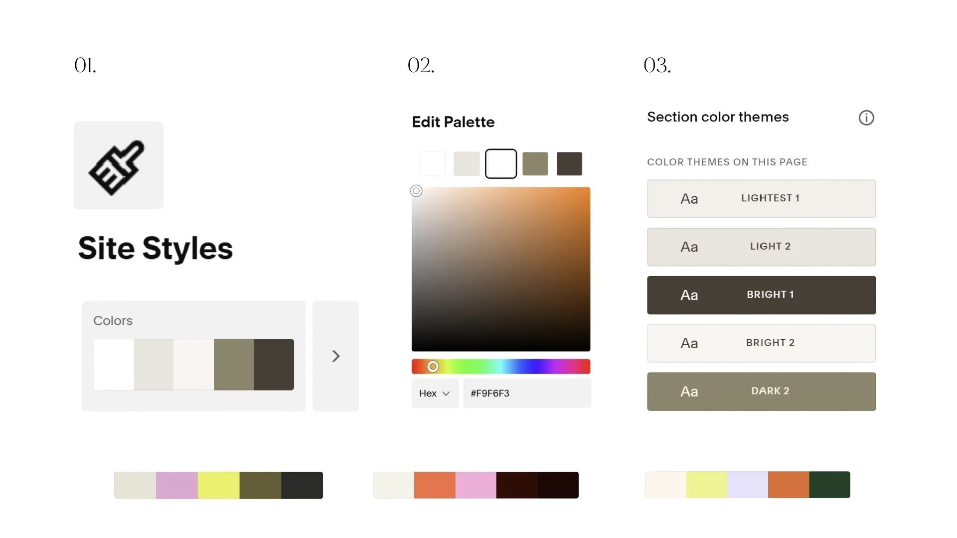
Step 1: Open Site Styles
Now it's time to start customizing your Squarespace template.
From any page in your website editor, click the paintbrush icon in the top toolbar to open Site Styles. Then select Colors.
This is where all of your website's colors are managed.
At the top, you'll see the current color palette that came with your Squarespace template. Below that, you'll notice a collection of color themes. We'll come back to those shortly, but for now, focus on the palette itself.
Think of your palette as the foundation. Once you update these colors, Squarespace automatically uses them throughout your website to create coordinated color themes. One thing I love about Squarespace is that you don't have to edit every section individually. Changing your palette here updates headings, backgrounds, buttons and links across your entire website, making customization incredibly quick.
You'll also notice Squarespace gives you a few different ways to build a palette. You can generate one from a photo, choose one of their preset palettes or enter your colors manually.
If you already have a brand identity, I always recommend entering your colors manually. The photo generator is fun if you're starting from scratch, but it won't match your brand exactly.
Step 2: Replace the Default Colors with Your Brand Palette
Click Edit Palette (or the pencil icon beside your color swatches).
You'll see a handful of color slots. Simply click on each one, paste in your hex code and press Enter.
Unlike some website builders, Squarespace doesn't ask you to define dozens of different colors. Instead, it uses a small number of foundation colors to generate all of your website's themes automatically.
I usually assign my colors like this:
Dark neutral → body text and darker backgrounds
Light neutral → page backgrounds and lighter sections
Primary brand colors → headings, featured sections and supporting accents
Accent color → buttons, links and calls to action
You don't have to follow this exactly, but having a clear purpose for each color makes your website feel much more intentional.
My biggest color tip
Try not to make every color equally important. Your accent color should feel special. If it's used on every heading, every icon and every button, it quickly loses its impact.
Instead, let it guide your visitors' attention. For most websites, I use the accent color almost exclusively for primary buttons and the occasional highlighted link. Everything else is supported by the neutral and primary brand colors. That small bit of restraint goes a long way towards creating a website that feels calm, elevated and cohesive.
Step 3: Apply Your Color Themes
Now that your brand palette is in place, it's time for the fun part.
When you update your palette, Squarespace automatically creates ten different color themes using those colors. Each theme is a ready-made combination of backgrounds, headings, body text, buttons and links that work well together.
Rather than choosing individual colors for every section, you'll simply assign one of these themes to each section of your website.
This is one of the reasons I love designing with Squarespace. It keeps your website feeling consistent while making it incredibly easy to experiment with different looks.
To change a section's colors:
Hover over the section you'd like to edit.
Click Edit Section.
Open the Colors tab.
Browse through the available color themes until you find the one that feels right.
As you click through them, you'll see the entire section update instantly.
I usually start with the homepage, working from top to bottom and assigning themes as I go.

Think in Sections, Not Individual Colors
One of the biggest mindset shifts when working with Squarespace is realizing you're not designing every element separately.
Instead of asking:
"Should this heading be green?"
Ask yourself:
"Should this section feel light or dark?"
Once you've chosen the right theme, Squarespace takes care of the rest.
For example, you might use:
a light cream theme for your introduction
a darker brand color for your About section
another light theme for your services
your darkest theme for testimonials or your footer
Alternating between lighter and darker sections naturally creates rhythm throughout the page and helps guide visitors as they scroll.
You Don't Need All Ten Themes
Squarespace gives you plenty of options, but that doesn't mean you need to use every single one. In fact, I rarely do.
Most of the websites I design only use two or three color themes throughout the entire site.
Repeating the same themes creates consistency, and consistency is what makes a website feel intentional.
When every section introduces a new combination of colors, the design can quickly start to feel busy.
If you're ever unsure, simplify. A website that repeats the same beautiful color combinations will almost always feel more elevated than one trying to showcase every shade in your palette.
Step 4: Fine-Tune Your Color Themes
Squarespace does a wonderful job generating your themes automatically, but occasionally you'll want to make a few adjustments.
Maybe your heading color doesn't have quite enough contrast. Maybe your button isn't using your favourite brand color. Or perhaps you'd like your links to stand out a little more.
The good news is that every color theme can be customized individually.
Back in Site Styles → Colors, click on any of your color themes.
You'll see all the individual elements that make up that theme, including:
Backgrounds
Headings
Body text
Buttons
Links
Borders
Decorative elements
You can change any of these while still keeping the rest of the theme intact.

Check Your Contrast
Beautiful colors don't mean much if they're difficult to read. Before moving on, quickly scroll through your website on both desktop and mobile.
Ask yourself:
Is every heading easy to read?
Does the body text stand out clearly from the background?
Are buttons obvious without being overwhelming?
If you ever have to squint to read something, your visitors probably will too. Sometimes the smallest tweak, like darkening a heading slightly or choosing a lighter background theme, makes a huge difference. Remember, the goal isn't simply to create a beautiful website - It's to create one that's effortless to read and enjoyable to use.
Step 5: Check the Little Details
At this point, your website is probably looking much closer to your brand. Before you hit publish, I always recommend doing one final walkthrough. Most of your website now follows your color themes automatically, but there are a few areas in Squarespace that sometimes need a little extra attention.
This only takes about ten minutes, but it's often what separates a website that looks "customized" from one that feels completely polished.
Here's what I always check.
Step 6: Preview Your Website on Every Device
Before calling your website finished, preview it on desktop, tablet and mobile.
Squarespace makes this easy with the built-in device previews, but I also recommend opening your website on your actual phone.
Sometimes colors look slightly different on different screens, and section layouts that feel perfectly balanced on desktop can feel heavier once they're stacked vertically on mobile.
As you scroll through each page, ask yourself:
Do the color transitions feel balanced?
Are all headings easy to read?
Do the buttons stand out enough?
Does everything still feel calm and cohesive?
If something feels slightly off, trust your instinct.
Usually it doesn't need a complete redesign. It might simply be one section that would work better using a lighter color theme.
A Few Design Tips I Always Follow
After customizing dozens of Squarespace websites over the years, there are a few simple principles I come back to every single time.
Don't Use Every Color Theme
Squarespace gives you ten beautiful color themes, but that doesn't mean your website needs all ten.
Most of my websites only use two or three throughout the entire site.
Repeating the same themes creates consistency, and consistency is what makes a brand feel memorable.
Let Your Accent Color Stay Special
Your accent color should naturally draw attention.
If every heading, icon, divider and button uses it, nothing really stands out anymore.
Instead, reserve it for the places where you want visitors to take action, like your primary buttons, important links or key highlights.
Simplicity Always Wins
Whenever I'm unsure about a design decision, I almost always simplify.
Fewer colors.
Fewer theme changes.
More consistency.
Beautiful websites rarely feel busy. They feel calm, intentional and easy to move through.
That's exactly what you're aiming for.
Give Yourself Permission to Tweak It Later
Don't worry if your website isn't absolutely perfect the first time around.
I almost always make a few small color adjustments after living with a website for a day or two.
Open it on your phone.
Look at it with fresh eyes the next morning.
Notice which sections feel a little too dark or where a button could stand out more.
The beauty of Squarespace's color system is that making those little tweaks only takes a few minutes.
Remember, your website doesn't have to be perfect before you launch.
It just needs to feel like you.
Frequently Asked Questions about Squarespace Colors
-
No. Changing your color palette won't change your layout, fonts, images or content.
Your Squarespace template structure stays exactly the same. You're simply replacing the default template colors with your own brand palette.
That's one of the reasons I love using Squarespace templates. You can completely transform the look and feel of a website without rebuilding it from scratch.
-
You can, but I usually wouldn't recommend it.
Some of the most beautiful websites use surprisingly few colors. A simple palette feels more cohesive, easier to navigate and much more timeless.
If your brand includes additional shades, consider using lighter or darker variations of your existing colors instead of introducing entirely new ones.
Remember, consistency is what helps a brand feel recognisable.
-
This is one of the most common questions I get.
While Squarespace automatically updates most of your website when you change your color palette, buttons and links sometimes need a little extra attention.
Simply open each color theme in Site Styles → Colors and check your button and link settings. It only takes a minute and makes a huge difference to the finished result.
-
Always use your exact hex codes instead of choosing colors by eye.
If you already have a brand identity, copy the hex codes directly from your brand guidelines or Canva Brand Kit and paste them into Squarespace.
It's the easiest way to make sure your website matches your logo, social media, marketing materials and everything else your audience sees.
-
If you're still choosing your colors, I'd recommend doing that before you spend too much time customizing your website.
A Squarespace template will always look its best when it's built on a clear brand foundation. Once you've chosen your colors, fonts and overall style, customizing your template becomes much quicker and the finished result feels far more intentional.
Final Thoughts
Changing the colors is one of the quickest ways to make a Squarespace template feel like your own.
In less than half an hour, you can take a professionally designed template and make it feel completely aligned with your brand, without touching the layout or starting from scratch.
If there's one piece of advice I'd leave you with, it's this: Don't overcomplicate it.
Looking for a Squarespace Template That's Easy to Customize?
All of my Studio Bressi Squarespace templates are designed to make customization feel simple, even if you've never built a website before.
With thoughtful layouts, beautifully balanced color themes and step-by-step video tutorials, you can launch a website that feels completely your own, without starting from a blank page.
Browse the collection of Squarespace templates and find the one that feels like home for your brand.